

How a Book Gets Made
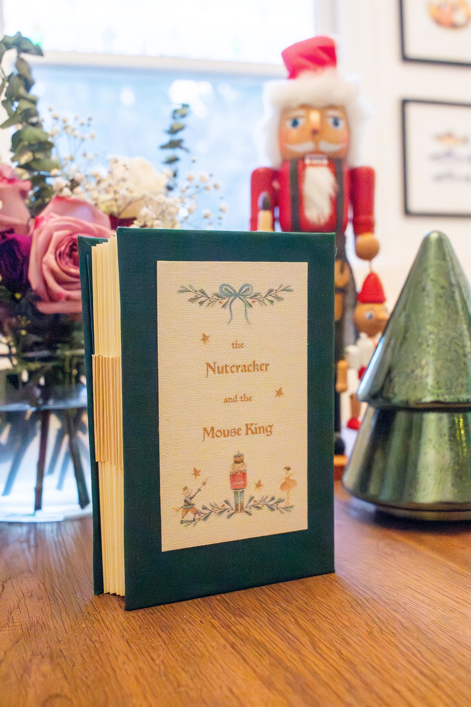
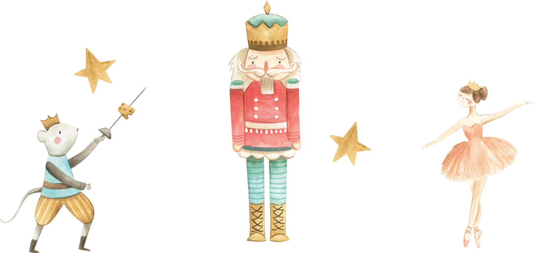
The Nutcracker and the Mouse King

Last week, I wrote a little piece about my feelings around a craft show I was in this past weekend. It was only my second time at a craft show and there was a lot of nervousness around it!

Like many things, worrying is unnecessary, all went well and I sold out of my copies of the Nutcracker! This unique book was made especially for the fair but has been an idea that I’ve been playing around with for a while. You can see how the book works below and in this letter I’ll share a peek behind the curtain of how this book came to be!


Cracking the Idea
I was confirmed to have a spot in the holiday craft fair about a month and a half before. Even though it wasn’t a lot of time, I wanted to create something festive and to bring an artist’s book. Something that combined book design and bookbinding and gives the reader a special, unique experience when reading it. I hadn’t seen many artist’s books in local craft fairs and thought it would be a great way to start introducing it to people.
I’ve always loved the idea of advent calendars, how every day you unlock a new surprise that builds the anticipation for Christmas. To go along with that idea, I was gravitating towards an advent storybook. A book that reveals itself gradually over the 12 days of Christmas and magically comes together on Christmas morning.
Finding the Right Structure
Books come in a variety of shapes and sizes, and I needed to find the right one for this idea. I needed it to be simple to put together, naturally segmented, and collaborative between myself and the reader. Since I knew it was going to be advent related, there was an element that the reader would have to do some of the binding themselves, so I didn’t want sewing, stapling, or anything like that involved.
I explored a lot of structural ideas like envelopes sewn together, pamphlets sewn into concertina mountain folds, and small stitched booklets housed in a box that could sit on a shelf like a miniature library.


They were fun ideas, but not quite hitting what I was looking for. Until, I stumbled on this blog post about a book structure called Flat-Style Australian Reverse Piano Hinge binding. The name may be a mouthful, but it was exactly what I was looking for. It ticked all of my boxes and had the potential to have a really beautiful presentation.
Finding the Right Story
With the structure chosen, I needed to choose a text. I initially thought of twelve different holiday and winter-themed short stories. While listening to The Nutcracker by Tchaikovsky, I realized that I had never read this holiday classic! I read through it and saw that it has 14 chapters. The craft fair was 13 days before Christmas and I realized it would be a great fit to use one story instead of 12 different ones. I could double-up on a chapter and the episodic nature of the story fit the format really well.
I now had the two essential parts of the project, the text and the structure. The blueprints have been drawn and construction can begin.
These are just dreams created by her ardent fever.
—The Nutcracker and the Mouse King

Bringing it to Life
With the foundation established, I moved into the design stage. First things first, I read the story through again to connect with the tone of the book.
Size and Page Construction
Next, I established the size. I initially went with a size that would fit in the palm of your hand, before realizing that it worked against both readability and production. The final size, 102 × 165 mm, allowed me to print two-up on US letter paper, which helped with readability and simplified the printing, trimming, and folding.
For the page itself, I used a page construction adapted from Jan Tschichold’s page canon. Jan Tschichold is a giant of the book design world, being responsible for the iconic orange Penguin covers, and he did research in establishing the optimal ratio of the text to page. These involved reconstructions of Gutenberg’s books as well as many from the medieval and renaissance period.
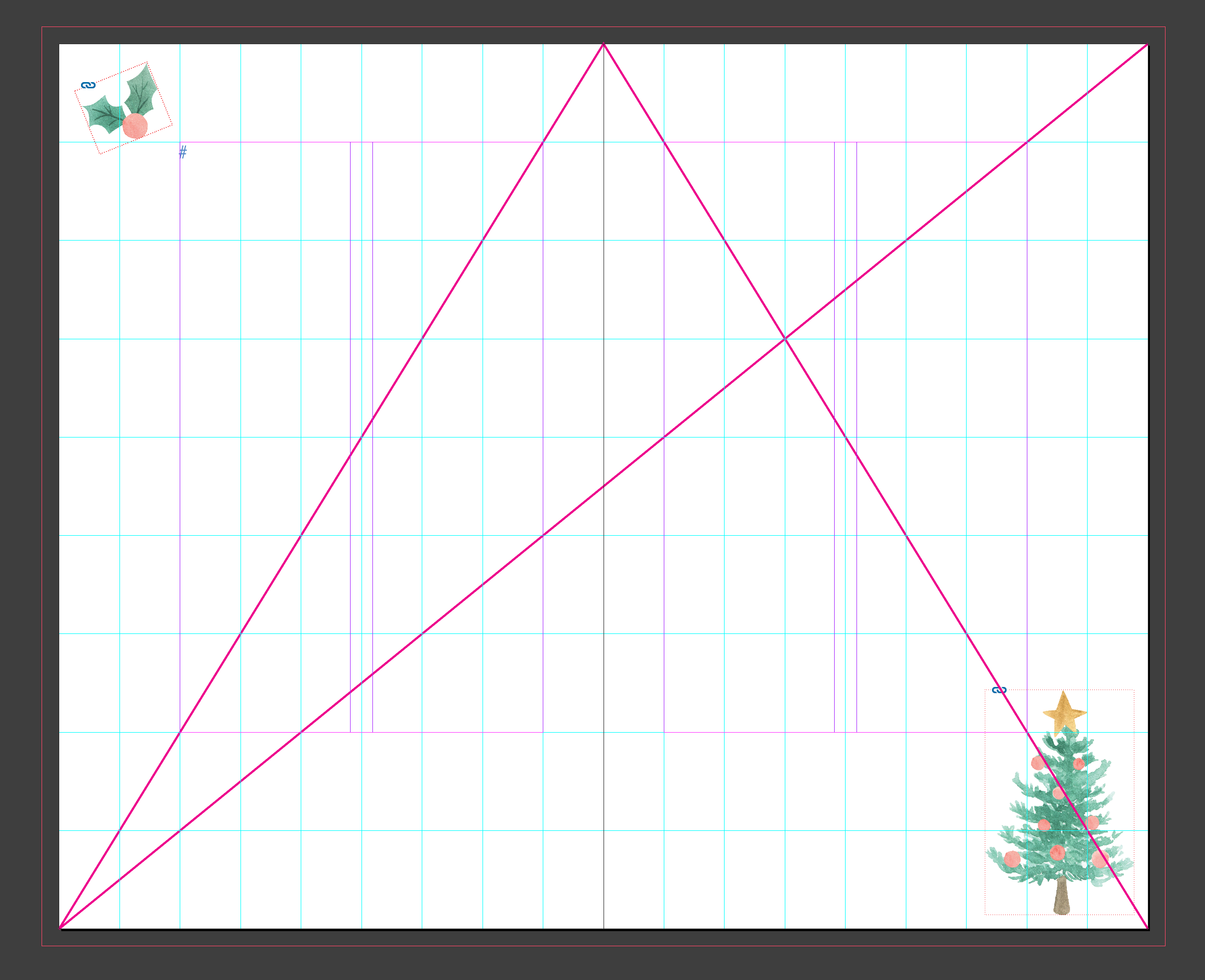
The page construction Tschichold help established is characterized with larger outside and bottom margins and smaller inside margins. The proportions are based on the golden ratio—as so much in art is—and involves several different methods. I used the method of creating a 9x9 grid, and setting the top and inside margin as half of the outside and bottom, with the outside/bottom set at 2/9.
I chose this specific page construction because of its classical heritage, it’s proportions can be seen through many handmade books of the early printing era as well as in Arts & Crafts books published by William Morris.
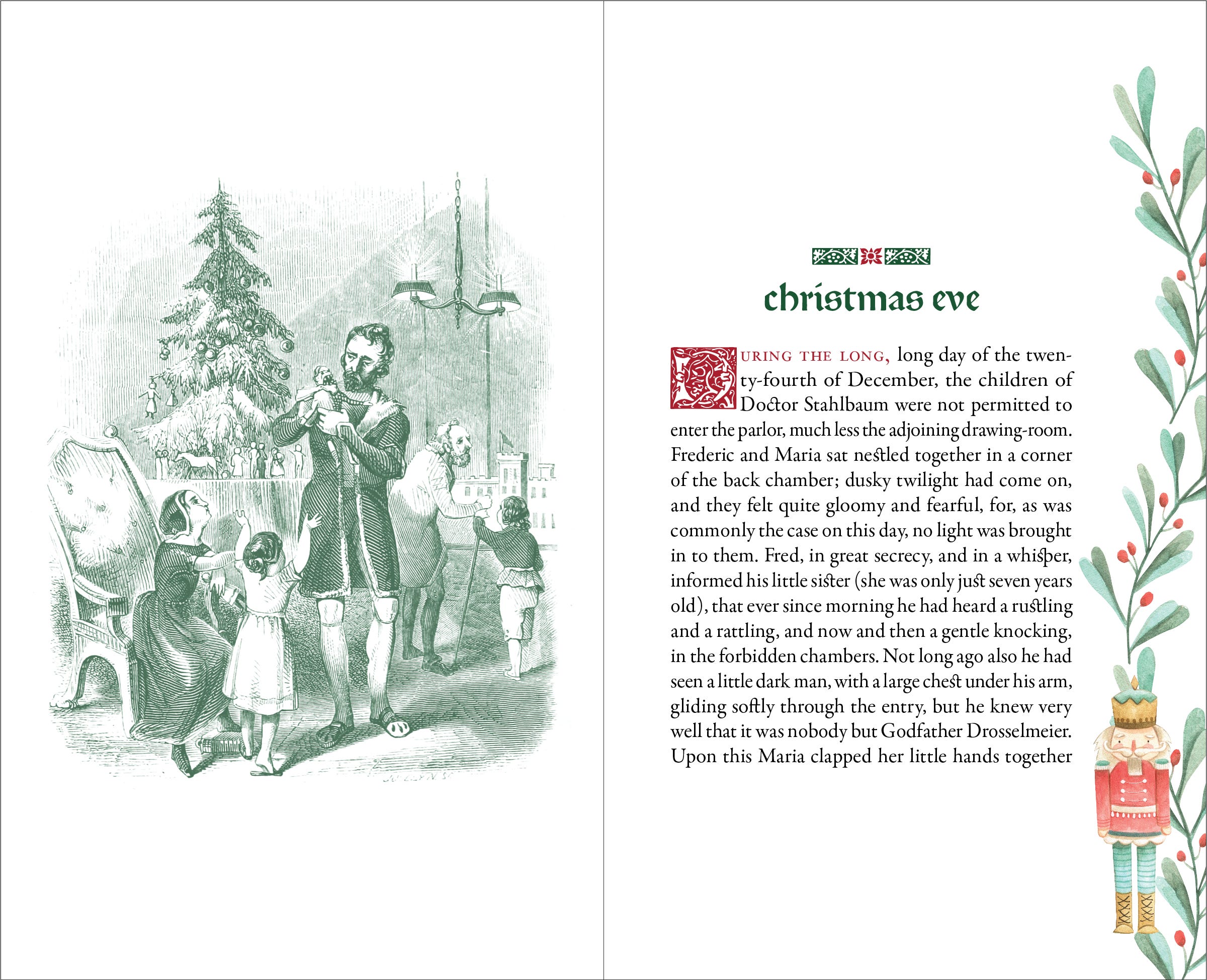
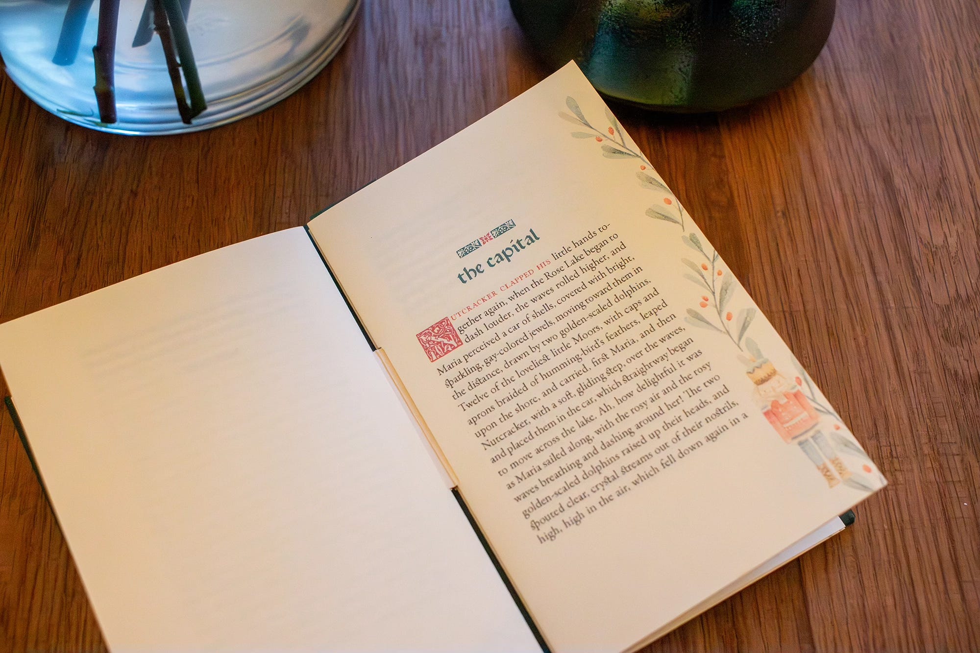
Typography
If page construction and size are the foundation of a book, typography is the walls that keep everything up. In keeping with the classical inspiration, for titles, drop caps, and ornamentation, I used P22 Morris—a typeface inspired by William Morris and the Arts & Crafts movement. For the body text, Garamond Premier Pro. It’s become something of a house style for me. Classic, readable, and dependable. They complimented each other like mint and chocolate or gingerbread and eggnog.


Illustrations
For the illustrations in the book, they were sourced rather than created like I would with any other book, and I found some Nutcracker illustrations that fit the vibe that I was going for in a watercolor style. The colors are beautiful, vibrant green, reds, and soft pastels. I distributed the illustrations in the style of my page inspiration utilizing the large outside and bottom margins to arrange the illustrations around as ornamentation. I created a system in InDesign where I was able to create different parent pages that can be mixed and matched, to create more unique looks. A handful of original woodcut illustrations for the book are included, that I cleaned up digitally and recolored to sit comfortably within the palette.
“Though largely forgotten today, methods and rules upon which it is impossible
to improve have been developed for centuries. To produce perfect books
these rules have to be brought to life and applied.”
— Jan Tschichold

Book Construction
Before committing to materials, I built dummies. These dummies would help me see what material decisions I needed to make and iron out any issues with the construction. This stage really came hand-in-hand with the design stage, in that I was creating dummies as I designed new drafts. It was in creating these that helped inform various design decisions like the size and type treatment. I also had to figure out issues like how intrusive the hinge felt when opened, how wide the central slit could be in proportion with the book size, and how large the tabs could be without overwhelming the page.


Eventually, the sizes were settled. Two-inch tall gold tabs and slits. One-inch wide locks. This kept everything in proportion with each other and maximized materials with less waste.
The materials followed the book design. Dark green book cloth for the case. Shimmering green endpapers. Gold cardstock tabs. Green locks. The text paper is a heavier cream stock—traditional, warm, and classic. The cover image was printed on inkjet canvas and mounted directly to the cover.


The last unresolved problem was presentation. Each section needed to be revealed daily, and I explored wrapping paper, envelopes, handwritten numbering—ideas that worked beautifully once but collapsed under repetition. Three days before the fair, the math became unavoidable. Precision notch-cutting alone accounted for hours. My goal was to create 10 books, at 130 signatures I was looking at a day and a half to cut the notches and another two to cut every wrapper.
In the end, I made a compromise. Printed number sheets and clear plastic sleeves replaced wrapping paper. I don’t typically like using plastic in my work, but it allowed me to get to the finish line.
Last Thoughts
The biggest thing that I learned from this was just how much development work goes into creating an artist book that is reproducible. When designing a traditional book, it is a lot simpler because I send it to a printer, whether Amazon or somewhere else, and they take care of everything. It’s a very standardized process that’s been done for years and years and years, and I don’t really have to worry about it.
Most of my previous artist books were made with the assumption that they would only ever exist once. This one forced me to think differently—not about mass production, but about duplication. What creative decisions will need to be made in order for this to made over and over again?
But that’s the price of doing something creative, and that’s something that I’ve learned in design, as well as art in general, is there are times where you have to make creative compromises. And that’s part of being creative is running into those limitations and real logistical life issues, and finding a creative and interesting solution that doesn’t compromise the heart of what you’re making.
This is beautiful! I can't tell you how much enjoyed reading this and seeing your process. It was such a refreshing change of pace, back to the roots of true bookmaking. I'm reading The Untold Story of Books and it's so interesting learning about the history of printing and publishing. This article fit right in with my vibe right now :)