

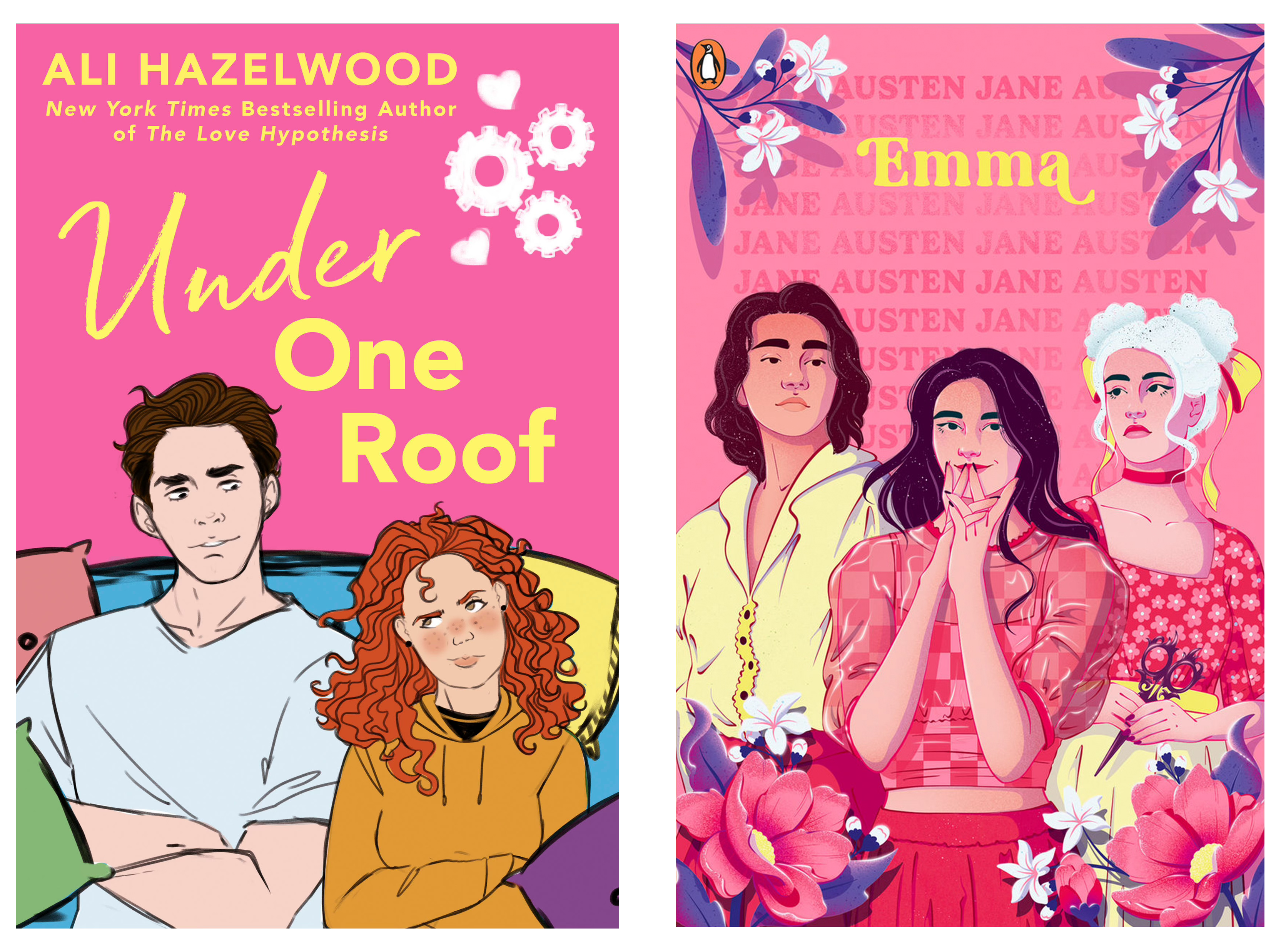
Jane Austen Gets a Makeover
Recovering the Classics

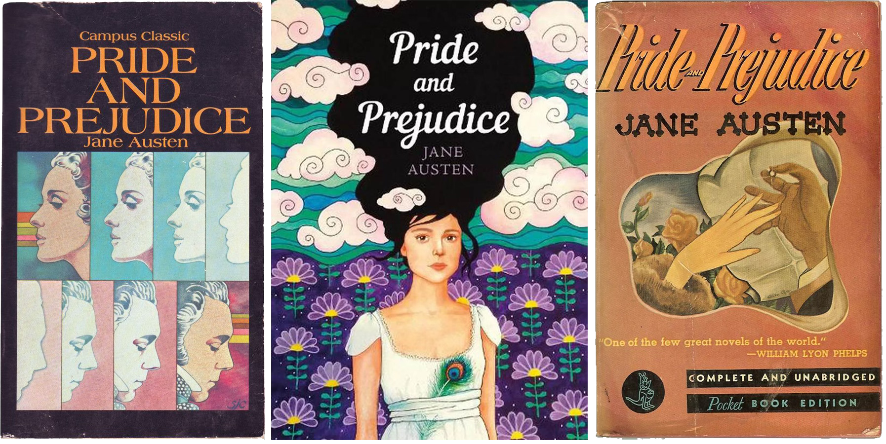
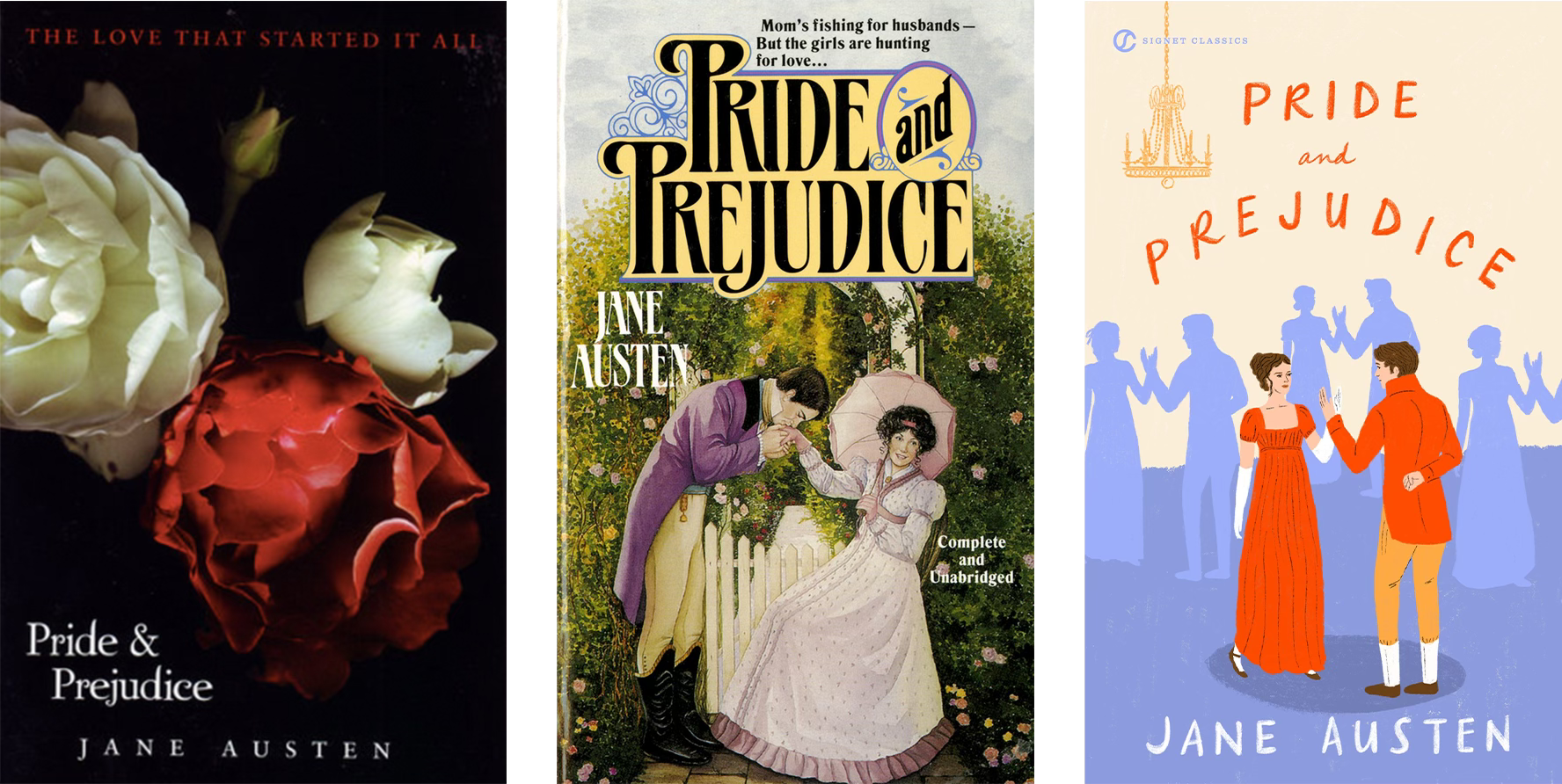
First Impressions
Nothing provokes a stronger response from book lovers than a new cover design. Especially one that “tiktok-ifies” a beloved classic.
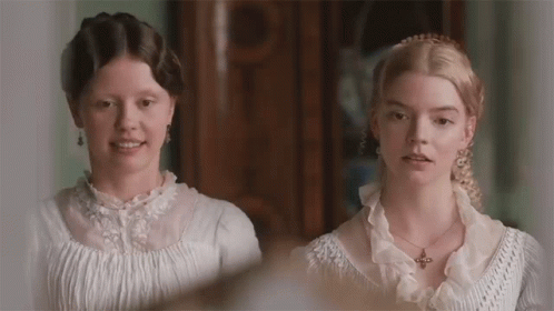
In this video essay by YouTuber and author Jack Edwards, he opens with a new book cover design for Jane Austen’s bibliography and explores the history and perception of romance novels. He touches on the audience reception to the covers—spoiler, not great—and whether they could be seen as disrespectful to a notable author like Jane Austen.


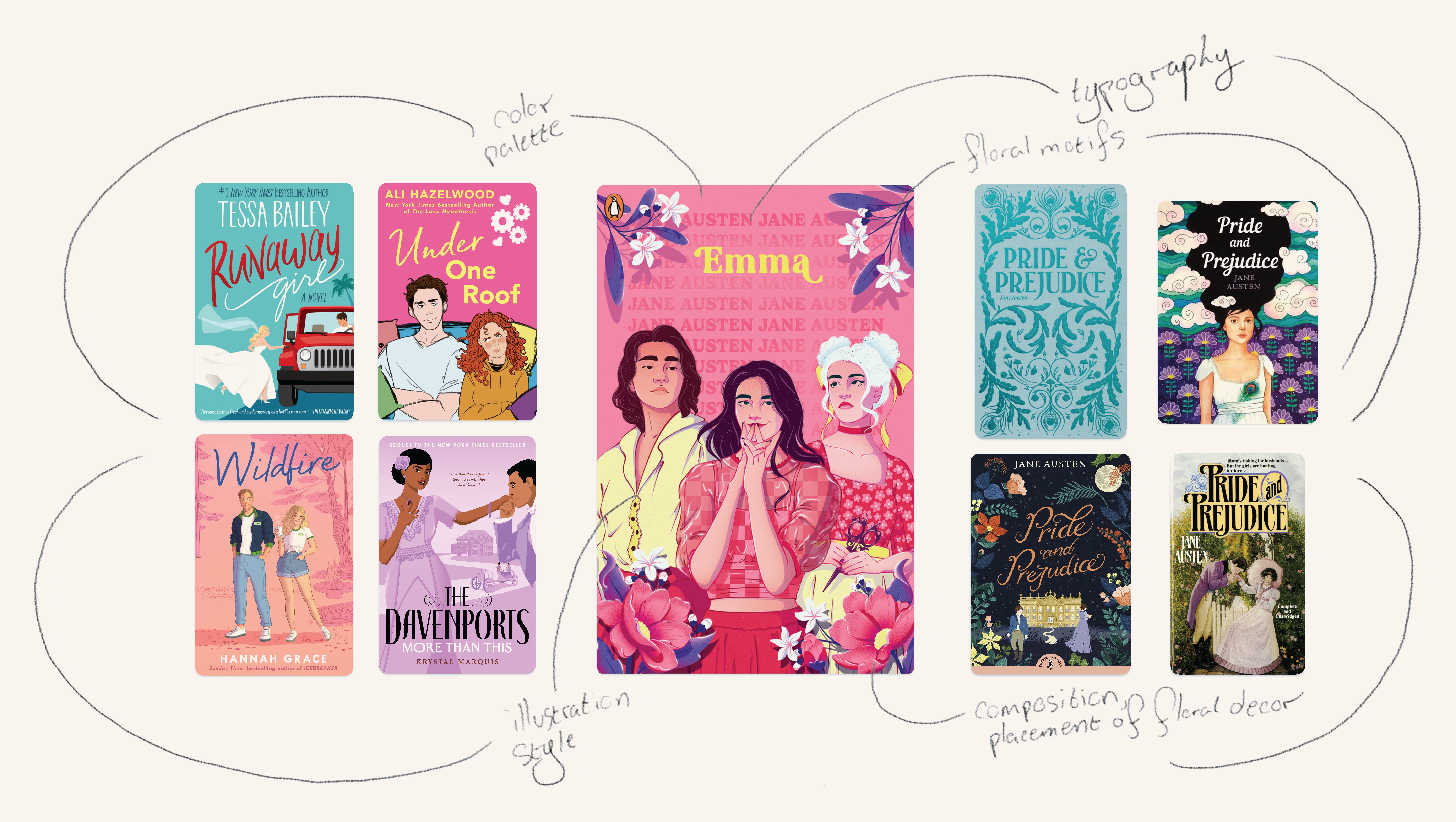
Romance covers have been dissected by many, so today, we’ll focus on the designs of Penguin’s “First Impressions” series (designed by Arabella Jones). Instead of giving my personal opinion, I’ll examine the goals, design techniques, and some strengths and weaknesses of the covers from a graphic designer’s perspective. There will be some detective work since we don’t have the original brief and pitch document, but hopefully this will demonstrate the type of thinking that goes into designing a book cover.
With that, let’s dive into it!
Creating a Concept
On Penguin’s website, they present their main direction for this collection as creating a connection between modern romcoms and Jane Austen’s novels. They are identified as a Young Adult collection—YA fiction mainly targets children between the ages of 12-18. Penguin describes their series as the following:
“With a stunning modern design and forewords from leading YA romance authors, this eye-catching six-book series is an open invitation to escape the brutal nonchalance of modern dating and embrace your inner romantic.”
In a time where reading among children is declining both in the US and the UK—where these editions are published—it makes sense for one of the Big 5 publishers to re-issue a collection of one of the most famous authors in the world and marketing it to that audience.
Bridging the cultural gap
This is not a new concept and is a method that has been used time and time again as a way to unite the author’s time period to ours. These reinterpretations bridge eras, testifying to Austen’s continued relevance. They offer a glimpse into the story through a contemporary lens. It’s not just capitalizing on a popular design trend, it’s speaking to the target audience—in this case 12-18 year olds—who may be unfamiliar with her or intimidated by the classics and creating a visual association with something more relatable.
It’s All in the Execution
The designer has the difficult job of balancing the contemporary with the past. She is creating a new interpretation of a book cover that has never been out of print for the better part of 200 years.
The new look
This is where the new covers succeed. The designer captures the visual style of contemporary romcoms and even elevates it. The designer blends both contemporary visual cues with traditional motifs like florals. The vibrant palette—rarely seen on Jane Austen titles or classics in general—adds freshness, shifting the tone from the classroom to a book club with the girls.
The illustrations have a flat, digital style seen on contemporary romance yet are rendered with more detail and with poses echoing classical portraiture.
Pushing the envelope… off the table
The biggest hurdle of reinterpreting a classic cover is knowing when you’ve gone too far, and I’ll preface by saying that Jane Austen is the one to take risks with. There are so many editions of her books and they’re not in danger of going out of print anytime soon, so why not go as far as you can? The worst thing that can happen is you have fun with it and it fades away. In the meantime, there will be teens who pick it up and get introduced to her books because of the covers. It’s a win-win when you think about it.
The dissonance we experience is from telling us that this is something familiar and recognizable while showing us the complete opposite.
But there’s clearly a disconnect, so what’s causing it? The thing that I notice the most is the typography vs. the illustration, both are giving conflicting messages. The typography itself is fine, but it’s the placement of the author name. Using it as a pattern in the background tells me that this is speaking to an audience so familiar with Jane Austen and her books that her name can be the least prominent element and yet there is no question about who the author is.
The renderings of the illustrations conflict with that message because they are such a huge departure from what we know about the time period and how the books have been collectively depicted in popular media.
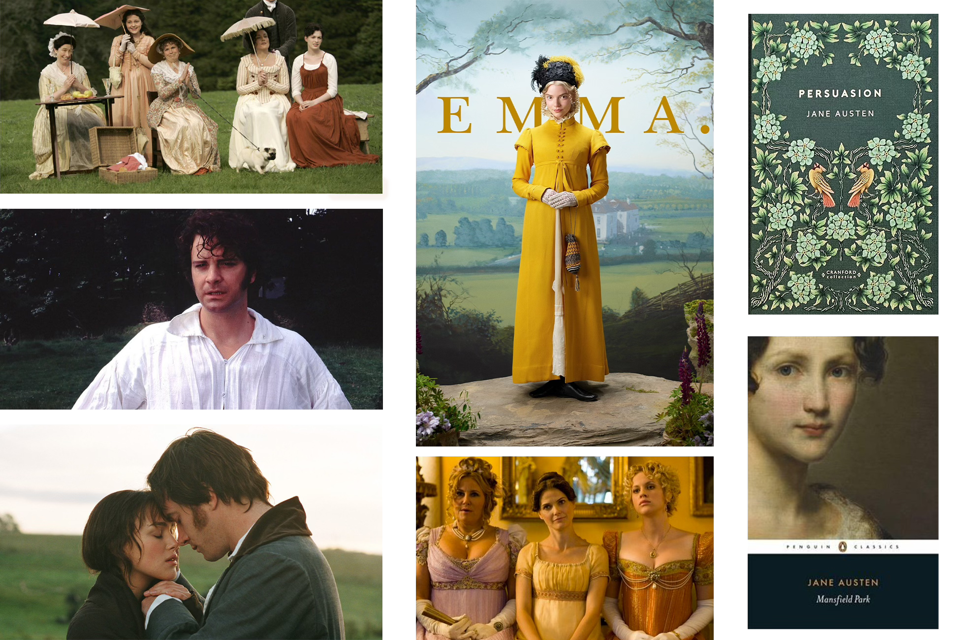
The dissonance we experience is from telling us that this is something familiar and recognizable while showing us the complete opposite. To most of us, a certain look has been ingrained in our heads of what Jane Austen should look and feel like, that these covers feel completely out of left field.
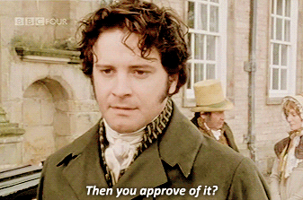
You can’t guide a ship if you don’t know where you’re going.
The other weak point is in the target audience itself. Take these stats with a grain of salt, but in my research, I found that an estimated 55% of YA readers are 19+. So YA books aren’t even reaching their nominal target audience. This is touched on in Edward’s video essay, he talks about this younger style of design being used for books with mature and often sexual themes. Some young people may pick up these new copies of Austen, but based on the data it’ll end up in front of an audience that is already familiar with her. It leaves us with the question, “who is the book really for?”
The Conclusion
You’re probably waiting for me to affirm the internet’s thoughts on these book covers. That they’re ugly, disrespectful of the classics, another pandering product to satiate TikTok’s urge to destroy everything good in this world. To which, I would say, no, I don’t think that. I think the designer and illustrator did a good job with what they were asked to do and given. They embraced a bold stylistic choice, especially with the characters—and with Austen, that seems like a fitting opportunity.
My main critique would be around the audience. That direction wasn’t clearly defined and that uncertainty shows in the final design. Not a fault of the designer, but from the brief. Clear direction is essential to crafting a successful design. You can’t guide a ship if you don’t know where you’re going.
Good question, Mr. Darcy. Let’s just say, I don’t disapprove of them and I definitely don’t see them as disrespectful of Jane Austen’s legacy. Rather, it’s a testament to her legacy and a recognition of her permanence in Western culture. This was intended for young teens—whether it reaches them or not—and they’re allowed to have fun with these stories. There’s an Austen cover for every kind of person, and there’s always room for one more.


Well written blog and execution on the covers!