

Judging a Book Cover
A Design Review of Black Bag by Luke Kennard

What Makes a Good Book Cover?
Criticism vs. Critique
Recently, I got my first advance copy of a book, which I’m super excited about. The publisher Zando reached out to send a copy of the upcoming book Black Bag by Luke Kennard—all thoughts and opinions are entirely my own, so no affiliate links or paid ads here. I thought this would make a great opportunity to take a closer look at the cover and use it as a way to help provide a guide to design critiques.
A common assumption that I’ve come across in my years as a designer is that, we are hyper-critical of other designs. I want to dispel this notion and celebrate other designers’ work by offering a critique—or analysis—of the design. This is very different from a critique I would give with my own designs or to another designer who is asking for one. This is an unsolicited analysis of a design in the wild, with the goal of our learning and not to guide the designer in what they could do better. There’s a lot we can learn when we look at others’ work with wonder and curiosity.
Design isn’t Always Subjective
What makes a “good” book cover can be very dependent on how you are viewing it. A book cover has the difficult job of visually translating a story. We’re turning a literal story into something more abstract. That result can be subjective when viewing as a reader/consumer because we’re working with our personal taste and subjective experience. When looking at it from a technical perspective, we are looking at the nuts and bolts of the design and not just our personal response. If I dislike a design, that does not mean it is poorly executed, and liking a design doesn’t mean it’s executed well. This distinction is important, whether you are self-publishing a book, working with designers, or are a designer yourself. A good critique will separate the self from the work, whether you’re the viewer or even the designer of the piece.
If I dislike a design, that does not mean it is poorly executed,
and liking a design doesn’t mean it’s executed well.
The Design Fence
Something I always try to remember when I see a design piece in the wild—or in my mailbox—is that I’m missing a lot of context. I don’t know the designer or the limitations placed on them by the design brief. A designer can be constrained by brand guidelines, color palettes, imagery styles, typefaces, marketing/sales, genre, and all manner of things. Those will play an immense role in the choices they make when designing. It’s then disingenuous to give an opinion about something I know nothing about.
What is valuable is to look at how they used the elements and principles of design to create the cover and to tell us a story. That’s how we can find new ideas and revel in the beauty of the craft.
I’m spending some time giving this background and philosophy of critique because I hope it gives you, the reader, an understanding of why we would critique a cover and what we hope to gain.
But that’s enough of my rambling; let’s dive in.
Part 1: The Cover
This analysis is written without reading the book or blurb, but purely based on just looking at the cover.
First Impressions
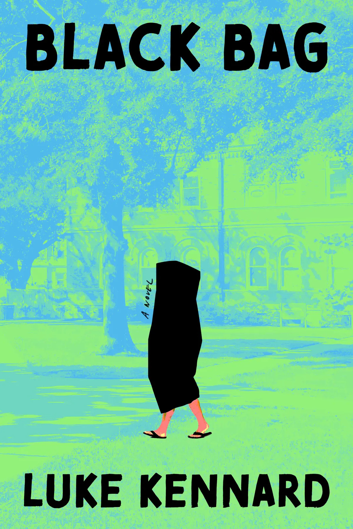
The first thing that I want to take a look at is the immediate reaction to the cover and what stands out. The first thing that jumps out at me is the vibrancy of the background.
It was the first thing I noticed when I opened the package; it’s hard to miss. It has this beautiful, almost neon quality to it. I’m in love with the striking vibrancy. It feels incredibly fresh and modern. I can immediately place it into the literary fiction space because of its overall style. The abstracted imagery and bold colors tend to be used more in literary fiction than in genre fiction.
Color
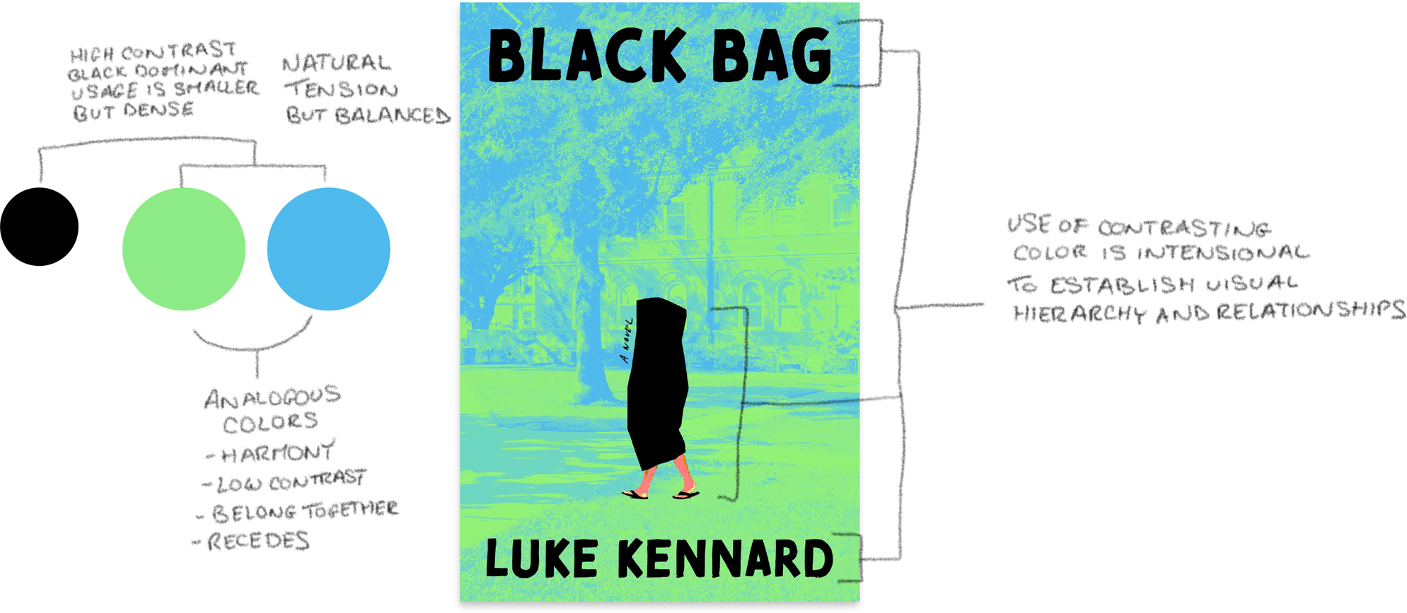
The color is the hook, and the shrouded figure is what reels me in. The designer uses color to create a strong contrast between the foreground and background, leaving us nowhere to look but at the figure. We move up, and again, using color, we have this connection to the title Black Bag and now, some understanding of what the image could be.
One technical aspect about the color is that I don’t think this green was printed using the 4-color process (CMYK). It’s hard to get colors this vibrant using CMYK. My guess is that this was printed on a green paper, the blue is a Pantone, and the rest is 4-color. Either way, this color was meticulously chosen for its effect.
Composition
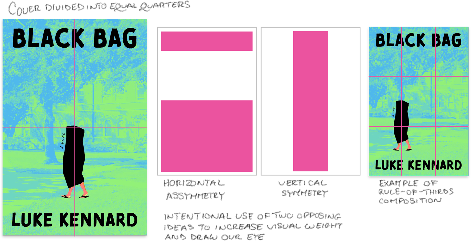
There are several things happening with the composition that I love. One is the use of line, and the other is the use of both symmetry and asymmetry. The composition mirrors the use of color where there’s a tension contrasted with harmony. The blue and green are analogous, creating a beautiful harmony with the black as a disruptor. The composition is doing something similar; there’s a vertical symmetry creating balance, and a horizontal asymmetry that provides visual weight. The top of the figure sits right on the halfway point of the cover. I feel like it isn’t quite a rule of thirds thing going on (see image example below), but a great use of symmetrical contrast to draw our eye to the central figure.
Line
The use of line is doing something similar to what the color and composition are doing. There are three obvious lines: the title/author name and the figure. Do you see the contrast? It should be screaming at you. Typically, designers will use line to allow the eye to move about the cover—now I’m going to argue two contradictory things coming up, bear with me—but the core lines seem to contradict each other. The text visually has a strong horizontal, with the figure being a strong vertical (there’s that contrast again). There’s also an implied line of the figure walking left, opposite of our reading direction. Side note: general advice for cover design dictates that when you have implied movement, you want it to lead towards the cover opening, not the spine. The idea is that you’re subtly leading the reader into the book, not away from it.
Okay, so we have our disruptive lines that don’t seem to follow convention, so why does it work and still look harmonious? That’s where the composition and color are coming in clutch. There are a lot of implied lines that are guiding us through the cover, that is creating this beautiful flow throughout.
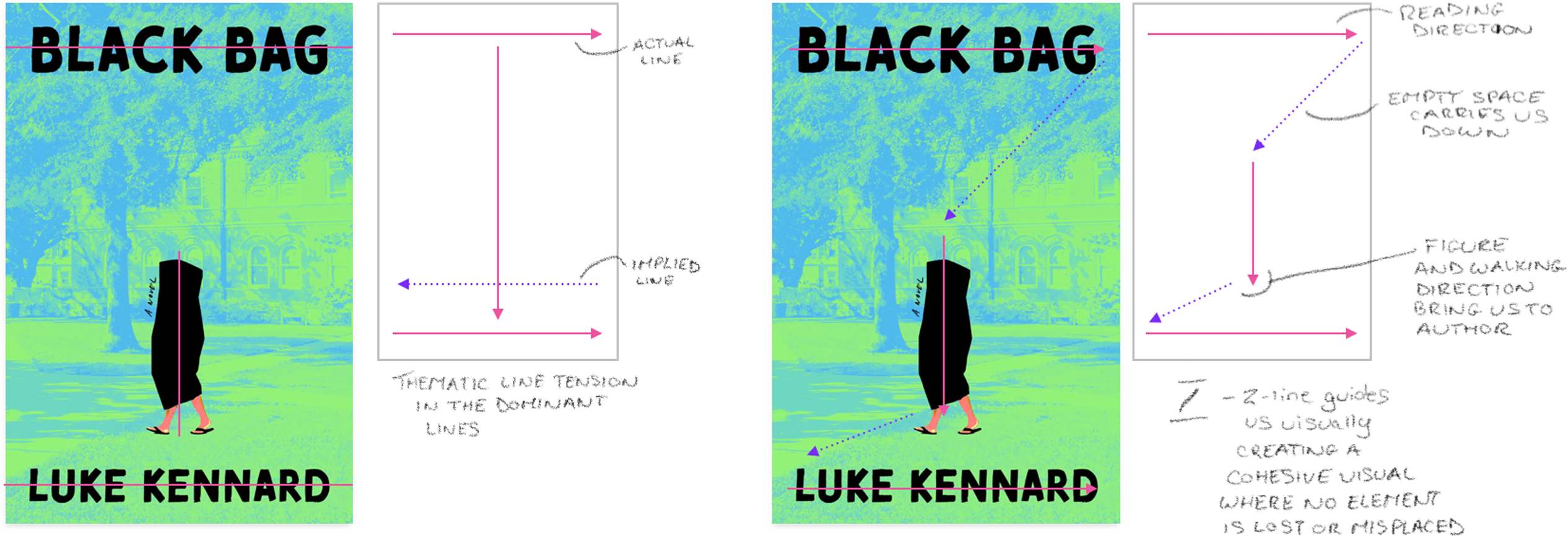
Telling a Story
The use of line is a fantastic example of how the elements of design play dual roles; they’re visual and thematic. Line here is doing its job of guiding our focus; it “ties” everything together. But I think it’s doing some thematic heavy lifting as well. The strong lines of the black elements and the opposing implied line of the walking figure are telling us something about the story itself. The figure is a disruptor. It gives us pause to ask the questions of “what is this person is doing?” and “why are they in a bag?”.
So much of design is predicated on shared visual language, which can vary across cultures, backgrounds, and generations. I’m reading the background as someplace idyllic, or at least a world that is of one thing and the figure of another. I see a black bag and think garbage bag or body bag. Both the figure and background are in opposition to each other, or maybe the figure feels that way. The figure is shrouded, maybe feels unseen but also alienated. There’s something nefarious about a body in a bag, but it also feels a bit humorous or tongue-in-cheek. The recurring visual theme of contrast and disruption is telling me themes of alienation, or unbelonging. With the stylization saying it’s not being too serious, maybe it’s an introspective book with a comedic undercurrent. Maybe not quite a comedy, but not quite self-serious.
This is where things can start to be subjective. We know what the elements are doing visually, but what it tells us and what we draw from it is going to be subject to our personal experience, visual language, and preferences. So, to take a pause, do you agree with me on the themes, or do you see something different? Take a moment to digest it. What does the cover say to you?
The elements of design play dual roles; they’re visual and thematic.

Part 2: The Cover, but now we’ve read the synopsis
An out-of-work actor accepts the role of a lifetime—sitting soundlessly in a lecture theater, zipped into a large leather bag—to aid a professor’s psychological experiment. What could possibly go wrong?
In Luke Kennard’s audacious new novel, a penniless and out-of-work actor picks up a job working for Dr. Blend, a university professor who is conducting a psychological experiment. How will Dr. Blend’s students react to someone zipped into an oversized bag, sitting at the back of the lecture hall over a series of Fall lectures? The role, eagerly accepted, soon has unexpected consequences. A professor of post-humanism develops research questions of her own—in particular, can you love someone secreted away inside a black bag?—and the actor’s childhood friend forms a vision for monetizing this new situation . . .
A warped campus novel, an investigation into the crisis of masculinity, and an off-kilter love story, Black Bag is a firework of a novel: blazingly funny and profoundly humane.
Great blurb. I would say I was within the ballpark thematically. There were a few things here and there about the story I did not pick up on, but overall, the designer did a fantastic job in getting me intrigued about the story and communicating the overall narrative tone the book wants to have.
I did not pick up on a romance aspect, masculinity, or even the setting of a university. And that’s okay. The designer is getting us to ask questions. They don’t need to resolve them. This mystery is good; there’s no resolution to these questions because the designer wants me to pick up the book to find out! The cover and blurb are working hand-in-hand to do the job of selling. Sometimes the cover may be enough, sometimes it needs the blurb, sometimes it takes reading the first chapter to be sold on it. It all builds on each other.
Part 3: Conclusion
It is the little things that are going to cause people to stop and take a look at a book. Then the next little thing will hold them a little bit longer. Eventually, as it continues to build visual momentum, the person will pick up the book and take the next action—until, hopefully, they buy it.
Lessons Learned
What we can learn from this case study is how the designer’s use of the elements and principles of design together, create something that is visually harmonious and thematically resonant. They don’t just create a pretty picture but tell us a story. It’s a constant questioning of, “How well do they work together visually,” and, “Does it say something?”. The elements may work together visually but be thematically empty. There may be something really important to the themes but it doesn’t work visually. It’s all about knowing what to keep and let go of to create something that works. Design is about establishing a goal and sending a message, but many times you can’t explain every little thing. Allow it to create intrigue and questions and give it time to build.
The Mastermind
I don’t want this to drone on like the end of Lord of the Rings. But I do want to address one question that I’ve gotten a lot. Whenever I go into this level of detail, the question inevitably comes up: “Does the designer really think through all of these things when designing?” And the answer, in my experience, is yes and no. It can depend on the work environment and designer, but a lot is instinctual. As a designer trains in the craft, there is an implicit knowledge of the elements and principles that becomes almost second nature. You know when it’s not right. It comes with time and experience, but also exploration. I don't know this designer or the Creative Director or how they work in their studio, but, for a cover at this level, I’d bet dollars to donuts there are hundreds of sketches to go with this one cover. Type, color, and layout explorations are not unusual and are common practice for designers. It’s a good way to see if you’re missing anything and to help build those visual and thematic connections.
I’m going to write a case study/critique on one of my own covers, one created for a self-published author, to give an example of the process, and we can get a little messier and maybe see how a self-published cover can both fare better and what we lose out on without studio support.
Again, this isn't paid or sponsored in any way, but thanks to Zando for sending over this great book! Check it out when it goes on sale on March 17th. Also, leave a comment if there’s anything you noticed that I didn’t touch on! I’d love to hear your observations on both the technical and thematic parts of the cover.