

Context is King
3 guidelines to designing effective book covers

Note: Portions of this newsletter was part of a contribution submission included in Should You Consider a Book Cover Redesign? by Eleanor Hecks for I Need a Book Cover.
What is a good book cover?
Ask 100 people and you’ll probably get 100 different answers. I love what the designer, Peter Mendelsund and English scholar, David Alworth, say in The Look of the Book, “the book cover is a first look at the text and a visual rendering of what the text says: it is both an interpretation and a translation from verbal into visual signifiers.” In their book, they open with the variety of emotions a book cover can convey and the collaboration required between designer/author and commercial/creative.
A good book cover will understand the commercial and storytelling context in which it is entering while also interpreting the unique voice of the text it represents. If you are a writer for a specific genre, a professional writing non-fiction books, or have a set of books set in the same world, branding can come into play.


Below, I’ve tried to breakdown three considerations when designing a book cover for a brand.
A good book cover will understand the commercial and storytelling context in which it is entering while also interpreting the unique voice of the text it represents.
Understand the trends
Looking at what is trending within your genre is a great place to start as it can help build a framework for what your cover should resemble. This is the commercial context. Understanding what is trending can help you decide how to meet it or when to buck the trend.
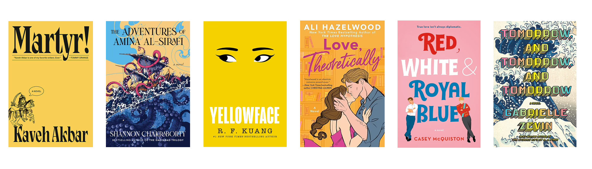
One trend that has been happening in the last few years is the use of bold, saturated colors. It’s appeared in typography, flat colorful backgrounds, and colorful imagery, across multiple genres. Kaveh Akbar’s Martyr! and R.F. Kuang’s Yellowface both use a bold yellow, paired with minimal, symbolic imagery that compliments the bold stories they tell. Romance novels like The Love Hypothesis and Red, White & Royal Blue by authors Ali Hazelwood and Casey McQuiston, respectively, utilize bright colors and illustrations to set a tone that’s playful and romantic. The Adventures of Amina al-Sirafi by Shannon Chakraborty and Tomorrow, and Tomorrow, and Tomorrow by Gabrielle Zevin use color to give us a sense of time and place. All of these covers utilize the trend of color in specific ways to communicate the unique stories that they tell.
Understanding what is trending can help you decide how to meet it or when to buck the trend.
Balance originality with market expectations
This has always been a delicate tightrope to walk. Book covers utilize art and can even become art, but it is also a commercial product that needs to cater to the market’s expectations. If a fantasy romance doesn’t look like a fantasy romance, there’s a good chance that the right audience won’t pick it up.
Originality and market expectations can be balanced by understanding the book and the themes with what is currently on the market for the book’s genre. By applying the first step of understanding market trends, we can start comparing that to what makes the book unique. This is the storytelling context. Originality can come out of questioning how to manipulate market trends—e.g. What would a gothic thriller look like without black? Or what would a romance look like without florals?—as well as bringing in elements that express the uniqueness of the book.


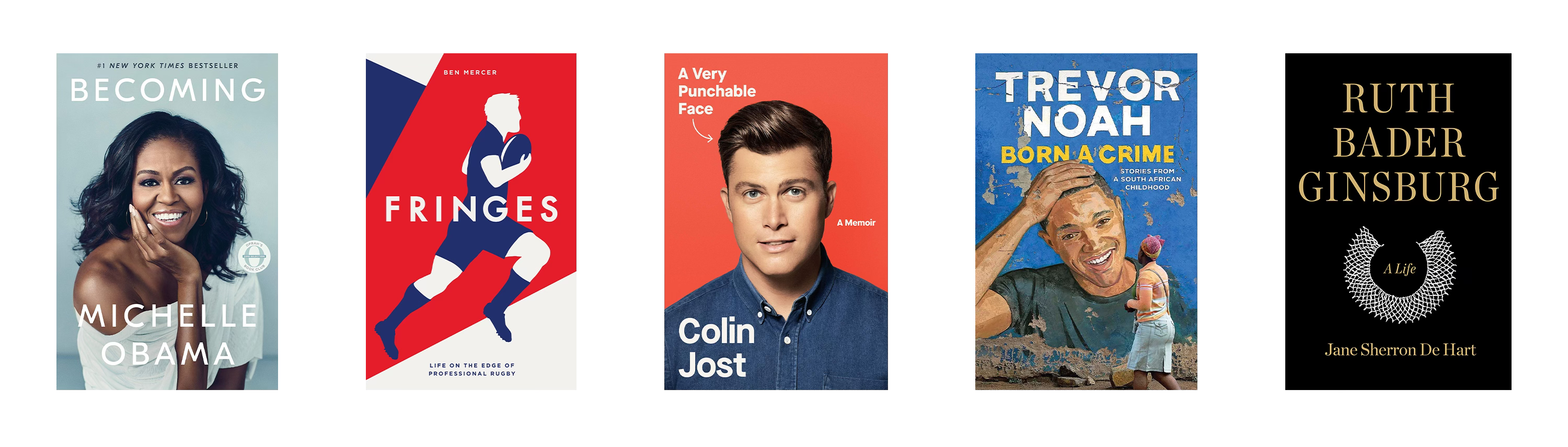
Faces on biographies and memoirs have been a trend for a while. You’ve seen them, a bold portrait paired a with sleek, sans-serif font. It’s effective and an immediate eye catcher. Especially considering their face and recognizability can be a big part of the subject’s brand. A great portrait on a memoir can say a lot about how they want to be perceived and what they want you to know about themselves. Miller Mobley, the photographer of Michelle Obama for Becoming, seeks to take photos that are honest and capture the soul of the sitter. The covers for comedians Colin Jost and Trevor Noah’s memoirs both play on the trend but with their own twist that showcases their personality and social context. The cover for Ruth Bader Ginsburg: A Life bucks the trend entirely, opting for an austere and minimal cover representing her legacy as a United States Supreme Court Justice.
When self-publishing, there can be even more freedom to explore and open yourself up to new approaches. This is something that author, Ben Mercer, would discuss with the designer of his memoir, Fringes: Life on the Edge of Professional Rugby. Self-publishing is a bold action and it opens the door for bold takes on trends. It can be an opportunity to take an intentional approach to show how you are different rather than following a trend just because it’s what others do.
Take an intentional approach to show how you are different rather than following a trend just because it’s what others do.
Maintain visual cohesion
Your brand identity is made up of your values and messaging. A book cover communicates those to your audience. Maintaining a visual cohesion will maintain a uniformity of messaging across a set of books, whether they be in the same universe or of a similar genre.
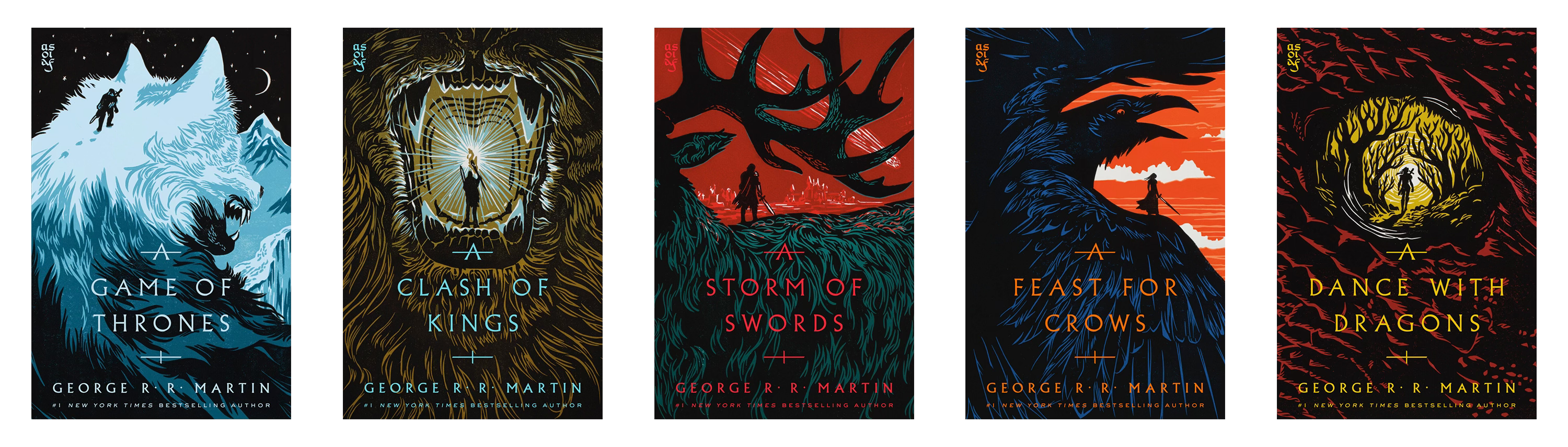
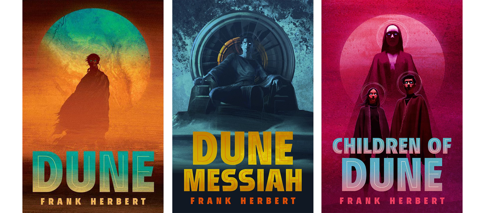
Two series that apply this in an exceptional way are Matt Griffin’s illustrative covers for the Dune trilogy and the new cover art for A Song of Ice and Fire by Faceout Studio. Both give a bold vision for legacy book series that are major multimedia franchises with passionate fanbases. It’s intimidating and steeped in established visual language. Griffin for Dune and the artists behind ASOIAF offer an exciting new look at their respective series without letting themselves be encumbered with the visual history. It’s refreshing, bold, and beautiful.
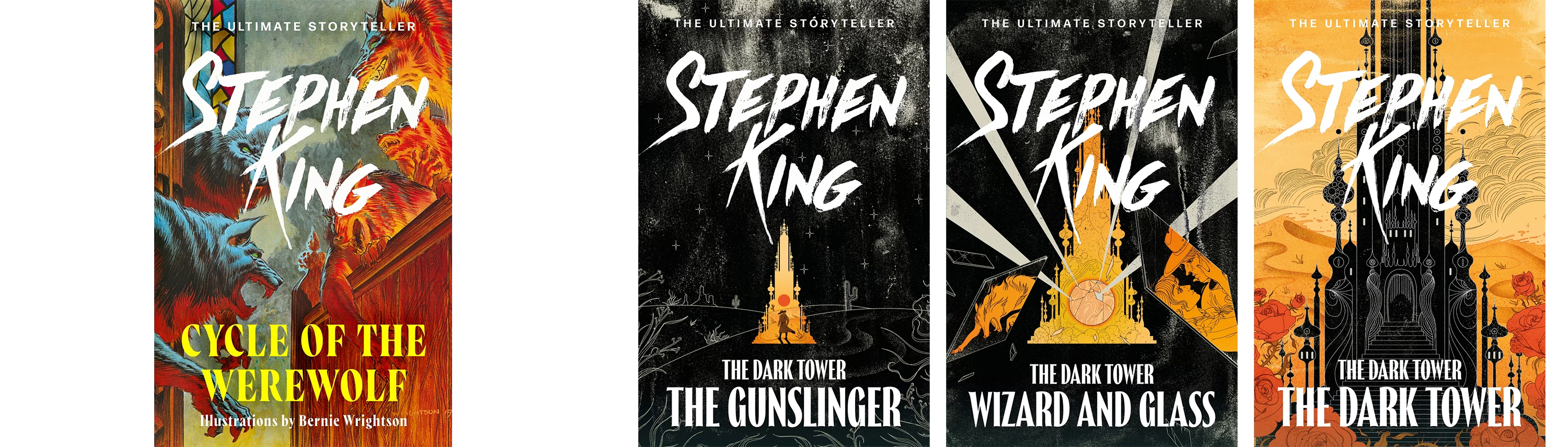
The new art for the UK editions of Stephen King by Hodder & Stoughton reimagines his extensive bibliography with bold colors, evocative imagery, and a consistent typeface and placement for his name—keep these things consistent to help the reader know what to expect, plus it looks nice. The Cycle of the Werewolf and The Dark Tower series are great examples of how the books can maintain an independent identity while staying consistent with the new brand style. The pulp fiction-esque illustration of The Cycle of the Werewolf gives it a classic horror vibe. At the same time, The Dark Tower series sets itself apart from the rest of the brand by using a heavy monochromatic color palette. The illustration style is fantastical and abstract, giving a visual cue that the series lives independently within King’s body of work. When you see the collection together, you can start to see what elements they’ve chosen to represent the brand and where they’ve deliberately chosen to break their own rules.
Conclusion
Designing a book cover is a reminder that there is a world and visual language outside of ourselves and it can be a delicate dance to find where to keep things familiar and where to highlight our uniqueness. To quote former US VP Kamala Harris, “You think you just fell out of a coconut tree?”
At the end of the day, though, rules were made to be broken. Ask yourself, what is going to serve this book the best? And remember that the best book covers are the ones that invite and entice you into the world that lies beneath it.
love this Josh! would be super interested to hear about cover designs between regions – one of your examples Martyr! (which I loved) was sent to me with a predominantly green and pink cover, much different to the yellow one you've referenced, and I'd love to know what determines these decisions!